Bridge-PCA
Contrast Calculator
| SAMPLE & ⇦ Click To Swap ⇨ |
|||||||||
|---|---|---|---|---|---|---|---|---|---|
|
|
|
||||||||
| PCA CONTRAST |
|||||||||
| LARGE: The quiet fox didn't wake the sleeping dog |
SMALL: The quiet fox didn't wake the sleeping dog |
||||||||
The Bridge PCA tool corrects some of the worst failings of the WCAG 2 math and methods, such as calculating contrast for "Dark Mode". Note: the WCAG 2 ratio shown here substantially exceeds that of other contrast checkers which use the WCAG 2 math.
Please Enter Valid Colors First!
Accessible Contrast
A Drop-In Replacement for WCAG 2
Bridge PCA was created due to the need for a contrast replacement that was fully backwards compatible with "WCAG 2" but that was actually based on human perception, which WCAG 2 is not. Bridge PCA is a drop-in replacement that can be used right now as a replacement for the error-prone WCAG 2 contrast math.
Bridge PCA reports contrast not only as the APCA Lc value (lightness contrast) but also with a WCAG 2 compatible ratio display, which can be used with WCAG 2 SCs like 1.4.3.
WCAG 2 Compatibility & Enhancements
WCAG_2 Drop N Go
Bridge-PCA is a "drop-'n-go" replacement for WCAG_2 math, and it's super easy to convert to WCAG_2 ratios. Like APCA, BridgePCA reports results as Lc (Lightness Contrast), and they align like this:
Use the following conversions for AA and AAA:
- Lc 60 exceeds WCAG 3:1
- Lc 75 exceeds WCAG 4.5:1
- Lc 90 exceeds WCAG 8:1
Large Font: 24px (18pt) normal weight or 18.7px (14pt) bold, or larger.
In addition, this tool displays a special WCAG 2 style ratio, that can be used directly instead of using the WCAG 2 math. This ratio exceeds the WCAG 2 math calculations, as it uses APCA technology. It corrects the serious failings of WCAG 2 for things like dark mode calculation.
However, to be fully backwards compatible, this does not correct the "false fails" for things like white text on a colored background, where WCAG 2 is also very weak. To maintain backwards compatibility, the WCAG 2 compatible ratio shown here gradually shifts into alignment with WCAG 2 when the lightest color is #c0c0c0 to #fff. When the lightest color is darker than #c0c0c0, Bridge PCA is essentially the same as basic APCA.
WCAG_2 Bridge-PCA Enhanced SCs
In addition, the following enhanced SCs can be added with Bridge-PCA to further improve readability guidance.
AA, Enhanced
SHOULD
(WCB means WCAG Compatible Bridge ratio)- Lc 15 (WCB 1.1:1 to 2:1) Invisibility point. Minimum for disabled non-text elements.
- Lc 30 (WCB 1.6:1 to 2.5:1) Minimum for non-content text such as placeholders or inactive/disabled text.
- Lc 45 (WCB 2.2:1 to 3:1) Minimum for logotypes.
SHALL
- Lc 60 (WCB 3:1 to 3.8:1) Large font only, no body text. Non-text okay.
- Lc 75 (WCB 4.5:1 to 5.3:1) 16px minimum for body text, 13px minimum otherwise
- Lc 90 (WCB 8:1 to 9:1) 14px minimum body text, 11px minimum otherwise
MAY
- Lc 90 (WCB 8:1 to 9:1) Suggested maximum for very large and bold elements, larger than 35px.
- The indicated WCAG 2 style ratio can be used as it adjusts slightly for greater flexibility, and maintains both backwards compatibility with WCAG 2 and forwards compatibility to APCA
AAA, Enhanced
SHOULD
- Lc 30 (WCB 1.6:1 to 2.5:1) Minimum for disabled elements (not hidden).
- Lc 45 (WCB 2.2:1 to 3:1) Minimum for incidental non-content text such as placeholders, or inactive/disabled texts, with a minimum size of 16px.
SHALL
- Lc 60 (WCB 3:1 to 3.8:1) Minimum for logotypes and essential non-text.
- Lc 75 (WCB 4.5:1 to 5.3:1) Large font only (24px and larger), no body text.
- Lc 90 (WCB 8:1 to 9:1) 19px minimum for body text, 16px minimum other content text, 12px minimum for non-content text (such as placeholders)
MAY
- Lc 85 (WCB 7:1) Suggested maximum for very large and bold elements, larger than 35px.
Font Use, Enhanced
SHOULD
- Prefer a font with an x-height ratio of 0.52 to 0.56
- Adjust the minimum font size for fonts with smaller x-height ratios to make up the difference.
- For instance the "large" font x-heights should measure
- 13.5px high normal (24px font body)
- 10.5px high bold (18.7px font body)
- Prefer a font no thinner than 300 weight
- Prefer a font no thicker than 700 weight
DO NOT USE
- Do not use
-webkit-font-smoothing: antialiased;on fonts smaller than 24px nor thinner than 500 weight.-webkit-font-smoothing: antialiased;is a faux blending method that results in contrast being reduced by more than Lc 15.- Instead, leave at default or set to auto:
-webkit-font-smoothing: auto; - It's important to remember that default is the best anti-aliasing for a given device, such as subpixel antialiasing, which is preferred in nearly all cases.
General APCA Guide: Simple Levels
These general levels are appropriate for use without reference to the lookup table. The lookup table simply adds additional accuracy, which allows for greater flexibility.
- Lc 90 • Preferred level for fluent text and columns of body text with a font no smaller than 18px/weight 300 or 14px/weight 400 (normal), or non-body text with a font no smaller than 12px. Also a recommended minimum for extremely thin fonts with a minimum of 24px at weight 200. Lc 90 is a suggested maximum for very large and bold fonts (greater than 36px bold), and large areas of color.
- Lc 75 • The minimum level for columns of body text with a font no smaller than 24px/300 weight, 18px/400, 16px/500 and 14px/700. This level may be used with non-body text with a font no smaller than 15px/400. Also, Lc 75 should be considered a minimum for larger for any larger text where readability is important.
- Lc 60 • The minimum level recommended for content text that is not body, column, or block text. In other words, text you want people to read. The minimums: no smaller than 48px/200, 36px/300, 24px normal weight (400), 21px/500, 18px/600, 16px/700 (bold). These values based on the reference font Helvetica. To use these sizes as body text, add Lc 15 to the minimum contrast.
- Lc 45 • The minimum for larger, heavier text (36px normal weight or 24px bold) such as headlines, and large text that should be fluently readabile but is not body text. This is also the minimum for pictograms with fine details, or smaller outline icons, , no less than 4px in its smallest dimension.
- Lc 30 • The absolute minimum for any text not listed above, which means non-content text considered as "spot readable". This includes placeholder text and disabled element text, and some non-content like a copyright bug. This is also the minimum for large/solid semantic & understandable non-text elements such as "mostly solid" icons or pictograms, no less than 10px in its smallest dimension.
- Lc 15 • The absolute minimum for any non-text that needs to be discernible and differentiable, but does not apply to semantic non-text such as icons, and is no less than 15px in its smallest dimention. This may include dividers, and in some cases large buttons or thick focus visible outlines, but does not include fine details which have a higher minimum. Designers should treat anything below this level as invisible, as it will not be visible for many users. This minimum level should be avoided for any items important to the use, understanding, or interaction of the site.
These define the basic minimum levels, what you might think of as A/AA in the old WCAG 2. For the equivelent to AAA, simply increase the contrast values by Lc 15.
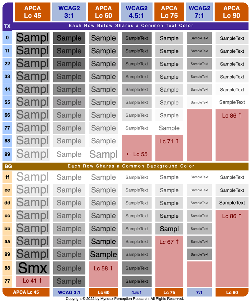
Comparison Chart (WCAG 2 vs APCA)
In this chart, we see that WCAG_2 contrast degrades losing readability as color pairs get darker, while APCA technology maintains readability across the visual range.
Additional Notes
Unlike the main APCA, BridgePCA is all about "emulating" WCAG_2 contrast. So, BridgePCA is a like-for-like replacement of the quirky WCAG_2 contrast math.
Like APCA, BridgePCA reports results as Lc (Lightness Contrast). Conversion to WCAG_2 ratios:
- Lc 60 exceeds WCAG II 3:1
- Lc 75 exceeds WCAG II 4.5:1
- Lc 90 exceeds WCAG II 8:1
DIFFERENCES: for best results, send the text color to the text input of the tool. Bridge PCA is "polarity sensitive," even though WCAG_2 is not. For light text on a dark background, the result will have either a minus sign, or an R for "reverse" after the LC value. N means "normal".
No Free Lunch: while BridgePCA corrects the many false passes and improves readability, the cost is that there is reduced design flexibility due to the fact that to maintain backwards compatibility, some contrasts are forced higher than they actually need be.
BridgePCA has some minor internal adjustments to align with some of the more incorrect aspects of WCAG_2 contrast math. In order to be backwards compatible, BridgePCA will not forgive the false-fails of WCAG_2, but BridgePCA will correct the many false passes which vastly improves readability.
But if you need a standards compliant method that also improves readability this is it. If on the other hand you do not need to abide by the letter of any particular standard, you may want to consider the more flexible full APCA solution.
The Accessible Perceptual Contrast Algorithm
APCA is a new method for calculating and predicting readability contrast. APCA is a part of the larger S-Luv Accessible Readability Color Appearance Model known as SARCAM (formerly SAPC). These models are specifically related to color appearance on self-illuminated RGB computer displays & devices, and also for modeling accessible user needs, with a focus on readability.
Lightness contrast Lc
The APCA generates a contrast value based on a color pair, and this value is perceptually based: that is, regardless of how light or dark the colors are, a contrast value of Lc 60 represents the same perceived readability contrast. This is absolutely not the case with WCAG 2.x, which far overstates contrast for dark colors to the point that 4.5:1 can be functionally unreadable when a color is near black. As a result, WCAG 2.x contrast cannot be used for guidance designing "dark mode".
The APCA contrast value is perceptually uniform, and pivots near the point where the CS curve flattens due to contrast constancy. Halving or doubling the APCA value relates to a halving or doubling of the perceived contrast. There is a subtle weighting for higher contrasts to smaller, thinner fonts.
Different Uses, Different Contrasts
The APCA has a set of levels related to use cases — for instance, Lc 90 is preferred and Lc 75 is the minimum for body text. This makes for an easy way to use ACPA, very similar to 1.4.3 in terms of ease of use.
The APCA also has an optional lookup table to associate font size and weight to the readability contrast (Lc value). The lookup tables allow for even greater accuracy and therefore greater flexibility in design.
Failing Pass/Fail
A key takeaway is that a strict pass/fail with a blanket contrast ratio is not instructive as a guideline, and does not necessarily solve a given user need. In fact, user needs when it comes to contrast are conflicting—what is good for one can be harmful to another. This is even true of font size.
This points to the importance of real user personalization, an area where the technology is literally missing (and a work in progress). For the guidelines though, we can set ranges for targets and expectations toward making the web readable for all.
The Science Behind SAPC/APCA
Accessible Perceptual Contrast Algorithm
For a brief overview and explanation of the SAPC math and methods, take a look at Experiment Results CE17, one of the polarity experiments. The discussion includes graphs comparing SAPC to other contrast methods, and related discussions.
Also, as spatial frequency is one of the most important predictors of contrast perception and readability, see Experiment Results CE14-weight for further explanations.
The "TL;DR" is: like all human perceptions, color and contrast are extremely context dependent. In terms of readability, there is a "critical contrast" level, and that level is more dependent on spatial frequency, which relates to font weight, than a given color pair.
To accurately predict contrast perception, the Spatial (font weight & size), color (perceived lightness difference between text and background), and context (ambient light, surroundings, intended purpose of the text) all need to be taken into account.
What is the Contrast of This Page?
Most of this page is set at Lc 90. To help differentiate between dark text on a light background and light text on dark, the math reports the latter as a negative value. But for purposes of the font lookup table, ignore the minus sign and use the absolute value.
Links to Resources and Articles
Featured Articles
Better reading on the web published in UX Collective, this article discusses and demonstrates the problems with automated testing and WCAG 2 contrast.
Please Stop Using Grey Text on Tangled Web, debunking one of the worst myths about design contrast.
What's Red & Black & Also Not Read? Do the WCAG 2 Contrast Guidelines Help Color Vision Issues? The answer may surprise you.
A Contrast of Errors A look into the history of the WCAG 2 contrast guidelines, and a discussion of the proposed replacement, the APCA (Advanced Perceptual Contrast Algorithm).
GitHub Documentation and Articles
Contrast
- Why APCA? A brief overview of WCAG_2 contrast issues and how APCA solves them.
NEW! Let's Flip for Color!
If you want your text to be either black or white if the user selects some random color, just where is that inflection point? Hint: It's NOT 18% Y.
- Part I: Orange You Wondering About Contrast? Answering some contrast questions, and demonstrating a real solution to the infamous orange conundrum.
- Part II: The Lighter Side of Dark Backgrounds An article comparing some parts of APCA with the old WCAG 2 contrast methods, demonstrating how WCAG_2 contrast does not help color vision types.
- Part III: WCAG 2 vs APCA Contrast Shootout Answering some recent questions regarding APCA, with comparisons and examples of the old (WCAG 2 1.4.3) and the future WCAG 3 / APCA.
Color
- Part I: For The Luv of Color An article comparing CIE Lab and Luv colorspaces.
- Part II: Will Work for Color A follow-up article on working spaces and related considerations. Introduces the concept of "Web Working Spacelets".
- COLORSPACES - The Primal Frontier A brief Look at the math that helps model how we see.
- How Many Colors in a Bushel? Just "how many" colors are there? Is that even an answerable question?
Related Repos
- SAPC-APCA The main repository for the research and development of the new contrast method and algorithm being developed for the W3/AGWG accessibility guidelines, and for other standards and applications. This is the primary source for all things related to SAPC and APCA.
- APCA W3 This is the specific version of the APCA licensed to the W3 for the use in web accessibility guidelines such as the WCAG_3 guidelines.
- Bridge PCA BPCA is designed as a drop-in replacement for WCAG_2 contrast that is backwards compatible, but using APCA technology, to "bridge" toward the future of readability contrast.
- Fancy Font Flipping Fancy Font Flipping is a demo I first put up in CodePen to illustrate the issues with flipping the text color from black to white based on a given estimated background luminance.
- Color Parsley lightweight and versatile color parsing functions.